Prudential Site Migration
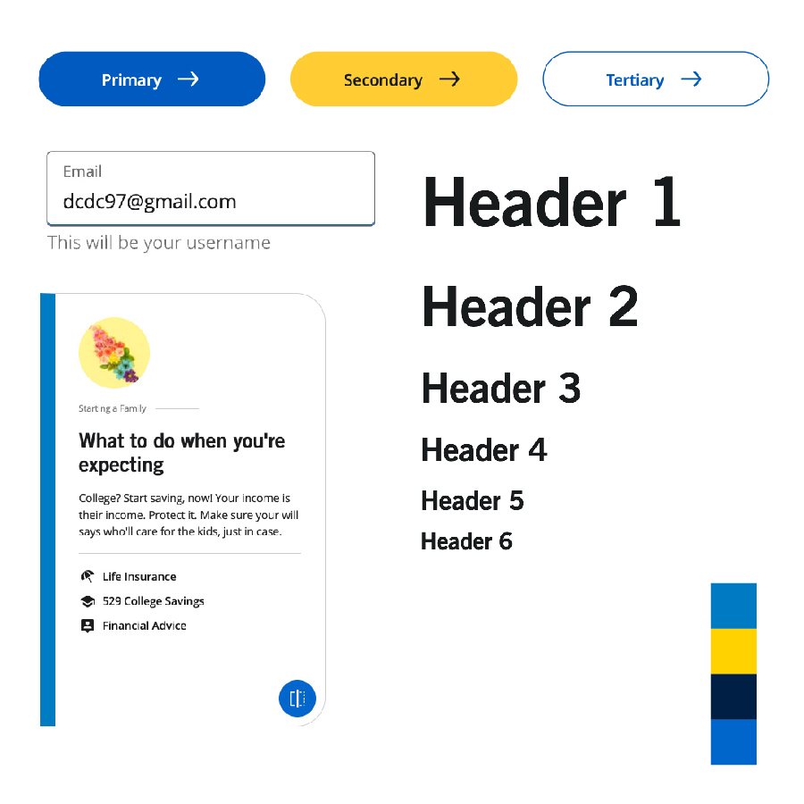
Prudential + Deloitte June 2022 - May 2023How do you redesign over 800 pages, leverage a new design system, and move the entire web platform to a new content management system (CMS)?
As the sole design system representative in this multi-team project, which also included Deloitte partners, I led the integration of the design system into this new platform.
View example page opens in a new window- UI development
- UI QA review
- Cross-team collaboration
- Adobe Expierience Manager
- W3C Web Components
- Becca Lisoski
- Stephanie Marca
- Navanita Sharma
- Elisa Schur
By the Numbers
Background
The initial pilot of the new Evolution Design System was only done on the Prudential.com homepage. This meant over 800 pages in production still did not leverage the new design system.
At the same time, the CMS these pages were built on was deprecated. Deloitte, a 3rd party partner, was in charge of the migration to the new Adobe Experience Manager (AEM) CMS, and in charge of implementing the design system components in AEM.
Problem
The majority of Prudential's digital content did not follow the new design system, leveraged an outdated CMS, and created a lack of design consistency across user journies.
Goal
Leverage the new design system to create reusable, adapatable, and scalable page templates that can be used to redesign and migrate all 800 pages to the new CMS.
My Role
Process
Legacy Audit
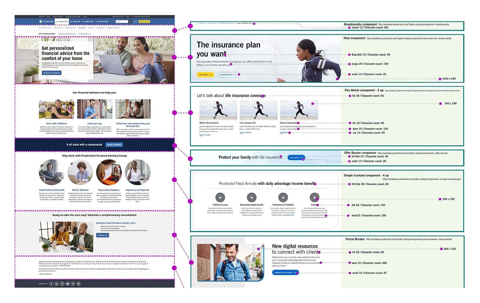
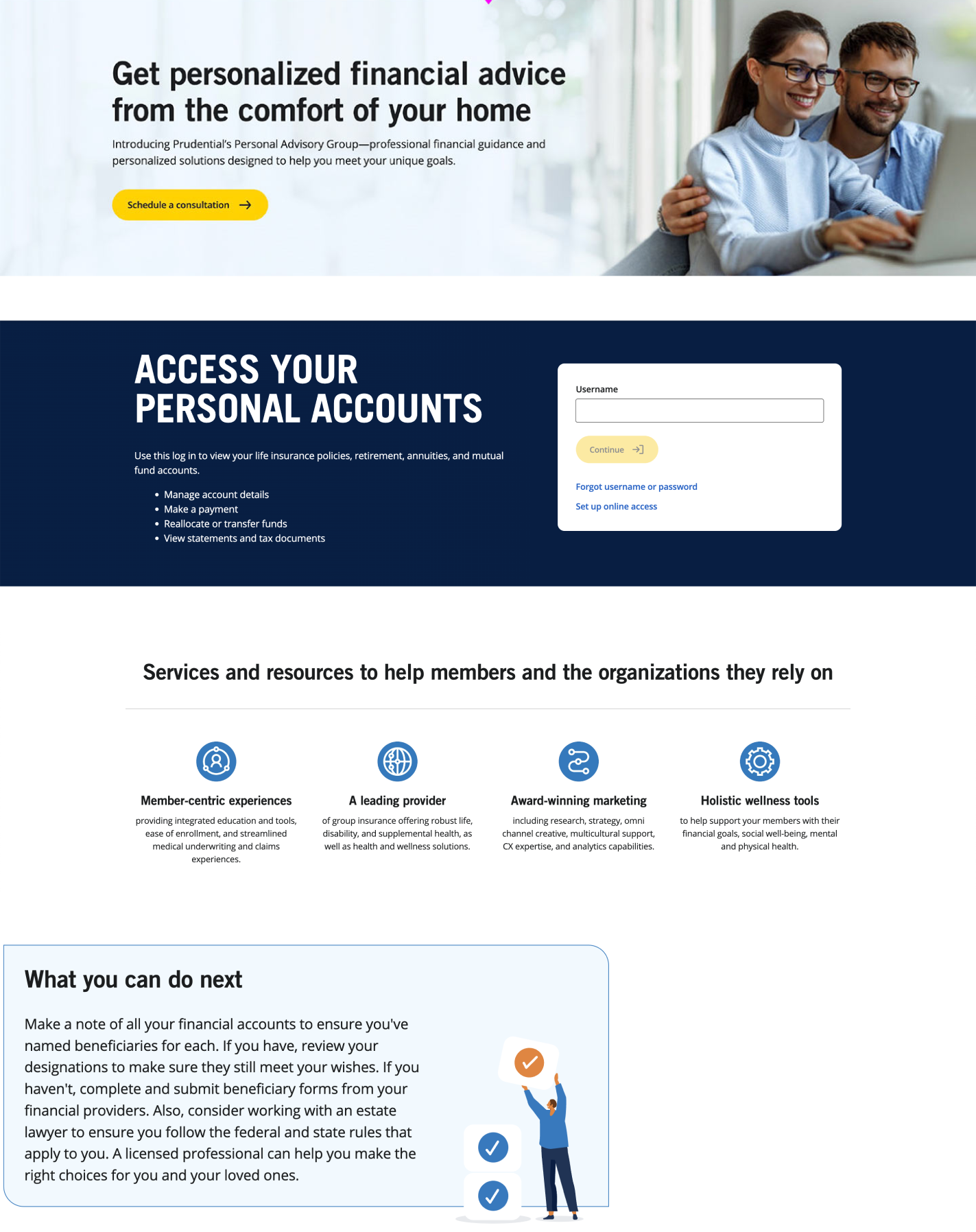
The first step in redesigning the pages was to examine the common elements used on them, from heroes to product pitches to ads. We determined if a component existed in the design system to use, or if a new component was needed.
My role: Provide guidiance and information to UX design and product on the components available, their current limitaitons, and coordinate work on new components.


New Design System Components
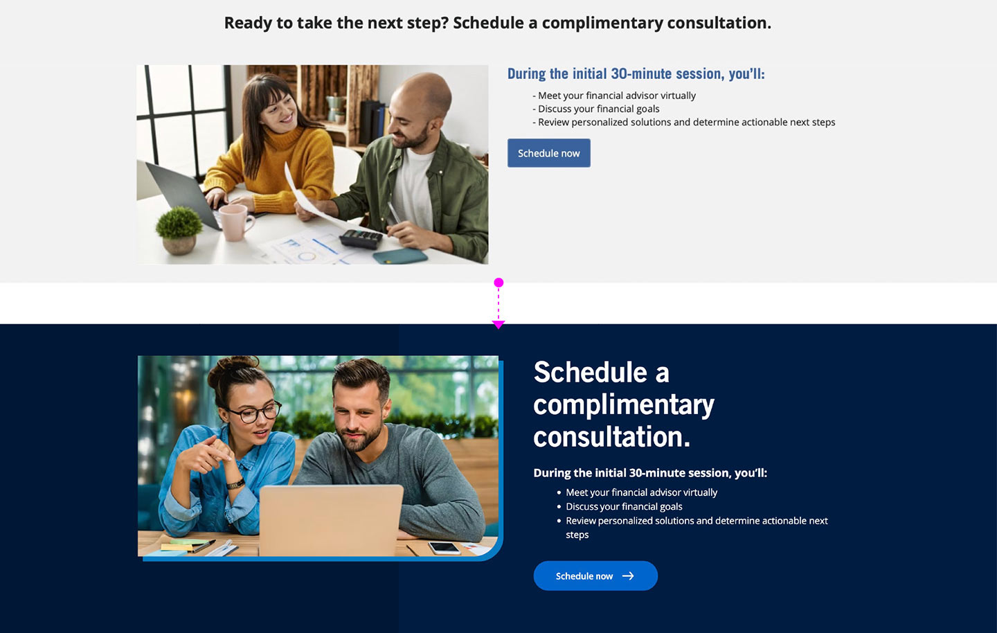
Out of the initial review, 13 new design system components were to be created for the project. The new components had to go through design and development by the design systems team, in coordination with the product team they were supporting.
My role: I led UI development of the new components, worked with designers on component requirements and variations, and coordintated deliverable timelines with product owners and Deloitte.
Component Mapping
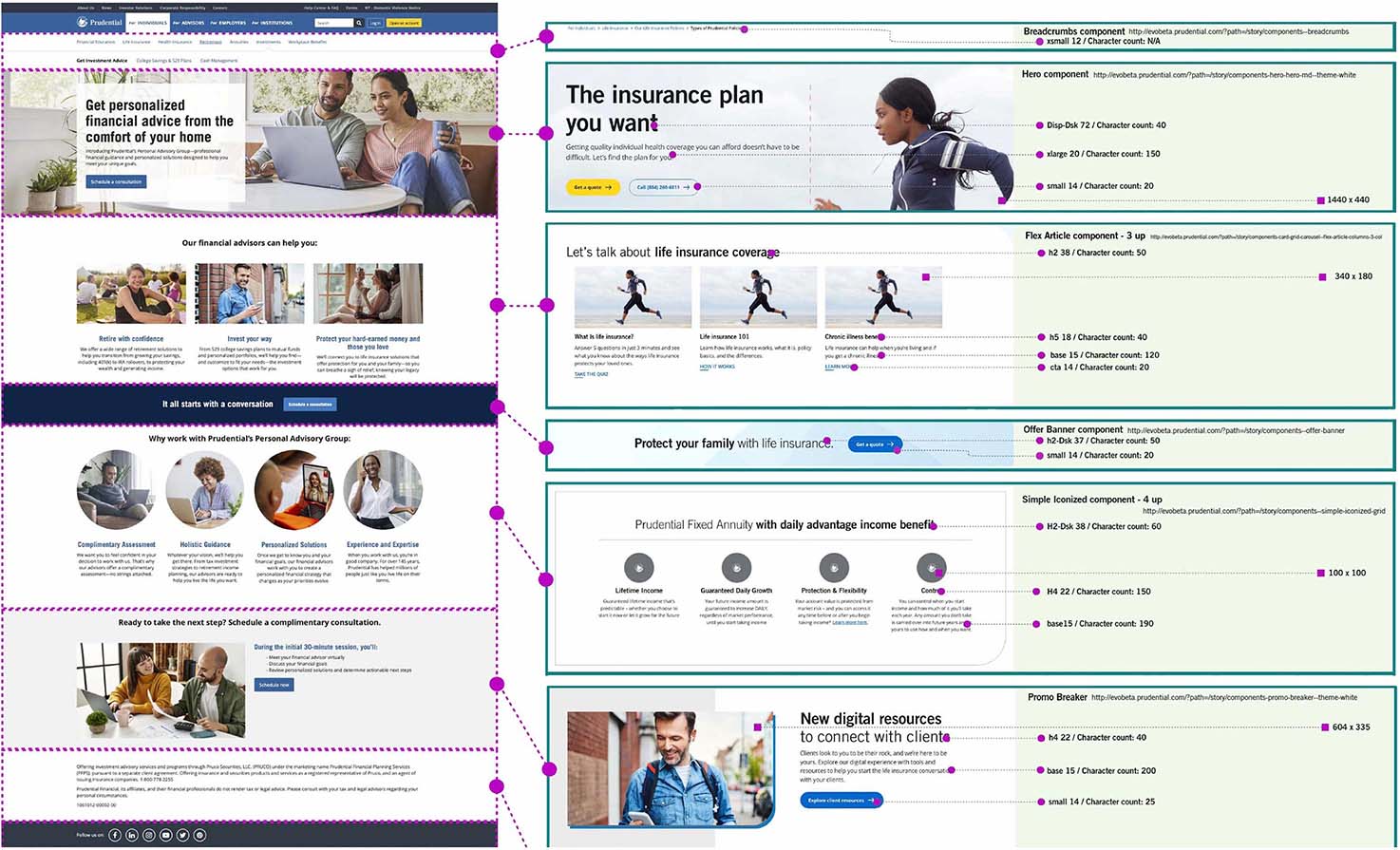
Each page to be migrated had its old content mapped to design system components. Each page's component map was created by the UX design lead. The mappings were reviewed by the design systems team before they were handed off to Deloitte.
My role: I reviewed all of the component mappings. I provided suggestions or component limitations to the desgner, and ensure eached page was ready for handoff to Deloitte.
UI QA Review
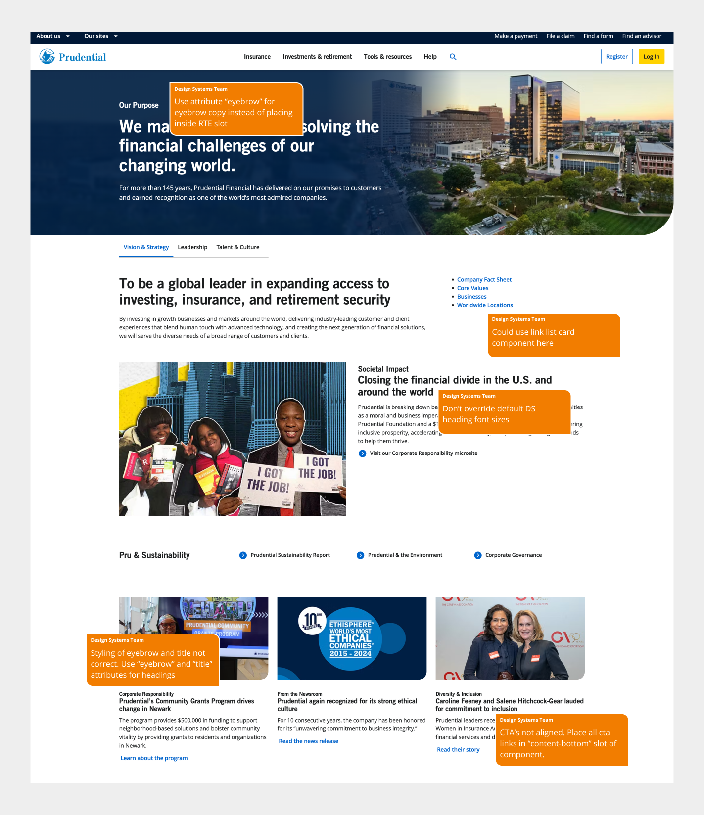
Once pages had been migrated by Deloitte they required UI review to ensure they were developed correctly. Reviews needed to examine any development issues on a page-by-page basis, and catch any global issues that affected all pages.
My role: I reviewed the pages and components built by Deloitte. With over 20 different authors, common mistakes occured frequently. I coordinated how to resolve these issues across design, development, and product.
Outcomes
- First site launch of a fortune 50 company in 6 years
- 800+ pages updated to use the new design system
- 342% increase in site traffic
- 13 new components created in the design system
Learnings
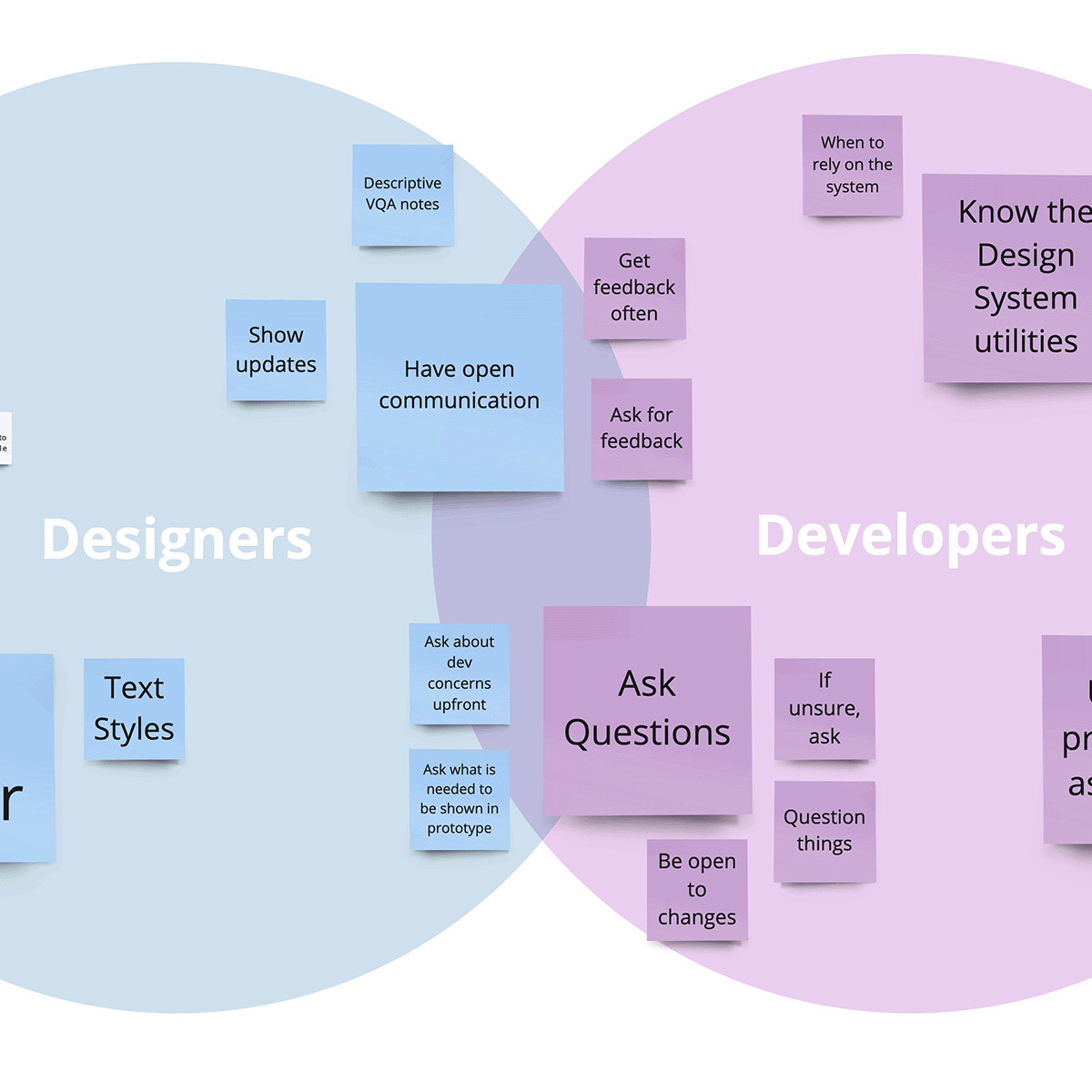
Working with a 3rd party consultant requires constant communication and alignment. You have to be equals, you can’t act like they’re doing a service for you, and they can’t act like they are the subject matter experts over you.
With massive long term projects, allocating additional time for background reseach saves time in execution. Understanding all of the requirements, old tech and design pitfalls, past knowledge, and establishing a working relationship are critical before the project start. Cutting down on this in the beginning will just lead to miscommunications, pitfalls, and extended timelines in the end.
No migration of this scale is going to be perfect. It’s about knowing where you can put your effort to get the most value, and thoroughly documenting those places to improve post migration.
