Evolution Design System
Prudential Sep. 2020 - May 2024As a leading developer, I co-founded the first company-wide design system at Prudential. Encompasing everything from techincal architecture decisions, workflow integration with partner teams, and promotion and adoption of the system, my work helped grow the system to support over 200 designers and developers.
View work sample opens in a new window Read zeroheight interview opens in a new window- Atomic design
- W3C Web Components w/ LitElement
- SCSS style library
- Storybook
- Chris Alexander
- Andrei Ivanov
- Antonio James
- Ashish Soman
- Joon Yi
By the Numbers
Background
Prudential was trying to lead a digital "evolution", to transform themselves into a digital first company for the first time in their 150 year old history.
However, the lack of a global design system led to its wide range of customer-facing experiences being disconnected and disorienting. The lack of shared libraries across design, development, and accessibility also led to a huge reduction in the speed to market of Prudential's products.
Problem
The lack of a enterprise-wide UI component library and design system led to increased time of design and development, a lack of connsistency across Prudential's digital experiences, and a build-up of costly reoccuring ADA defects acorss products.
Goal
Create the first global design system to improve the efficiency of design and development, establish design consistency across Prudential's digital experiences, and reduce the number of reoccuring ADA defects.
My Role
Process
Design Alignment
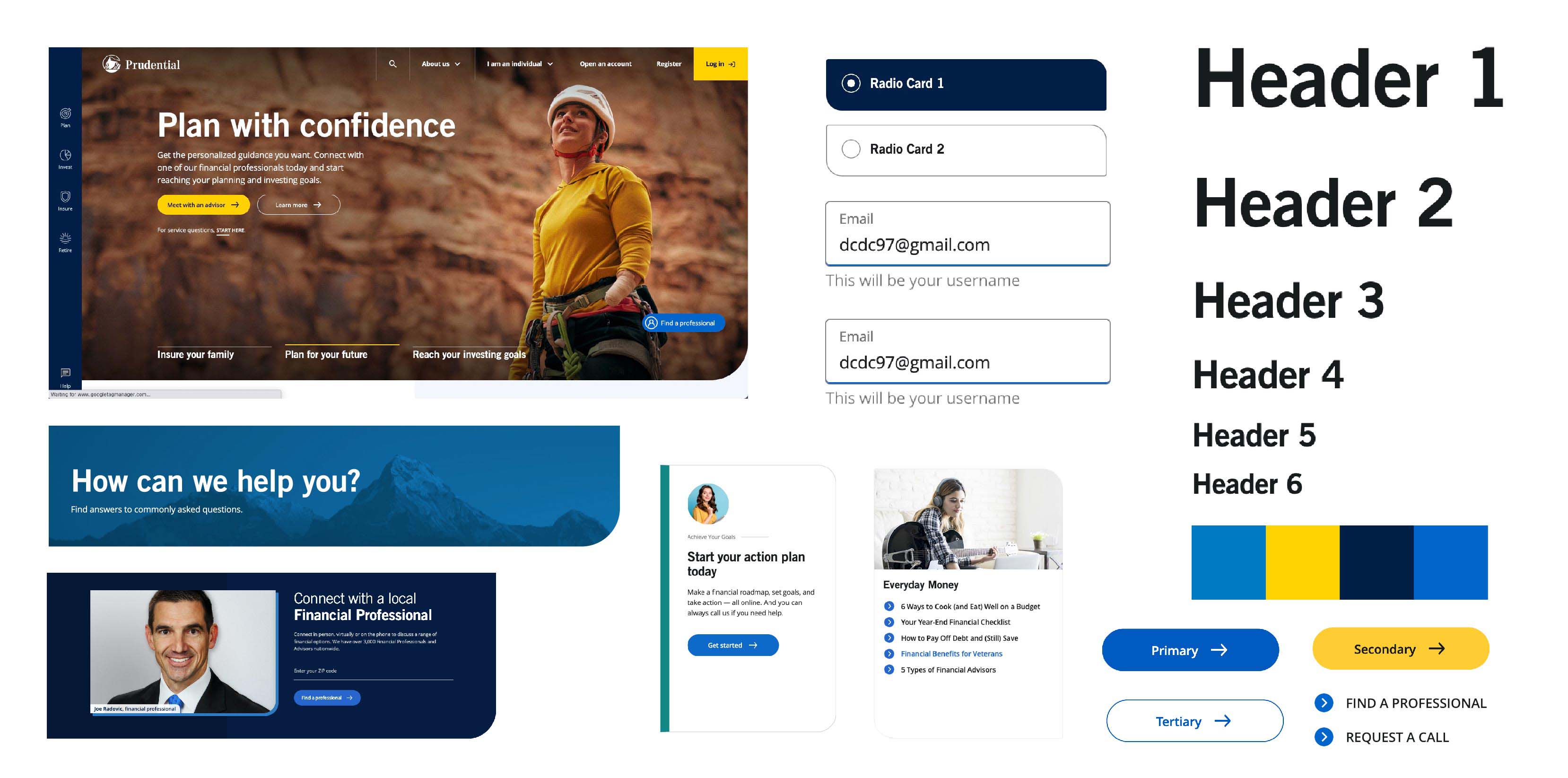
To ensure the scalability of the design system across design and development, an atomic design structureopens in a new window was implemented to create scalable and reusable components that could combine together to support a variety of use cases.
My role: I collaborated with designers, to match their Figma library atomic design approach in our UI component library. I made suggestions where component decisions could be made that would improve the scalability of components in development.

Technical Architecture
Due to Prudential not having a consistent front-end framework across development teams, we used LitElementopens in a new window and W3C standard web components as the tech stack. This ensured the library could support teams in React, Angular, and any other potential framework.
My role: I researched potential technnical solutions in various languages. In order to validate the architecture eventually chosen, I created the first POC component, that then established what all other components would follow.

CSS Library Foundation
The foundation of the design system was a CSS / SCSS library. Using a design token based infrastructure, the team created a library built around flexibility, consistency, and scale across color, typography, spacing, and more.
My role: I led the modernization of CSS styling, through efforts related to tokenization using CSS variables, creating reusable animation libraries, and standardization of SVG usage.

UI Component Library
The core artifact of the design system is a UI component library of over 100 components, available as an NPM package to anyone at Prudential. The library implements the atomic design structure of the matching Figma component library. Each component in the library contained numerous properties to allow for customization and flexibility in implementation.
My role: To date, I have contributed over 50 components to the library, and estlibshed standards for how properties should work together available across components.

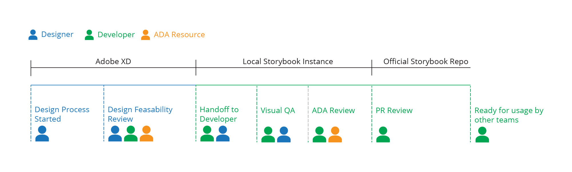
Contribution Process
To solve the open question around how components could get added to the design system, a new contribution proccess needed to be established.
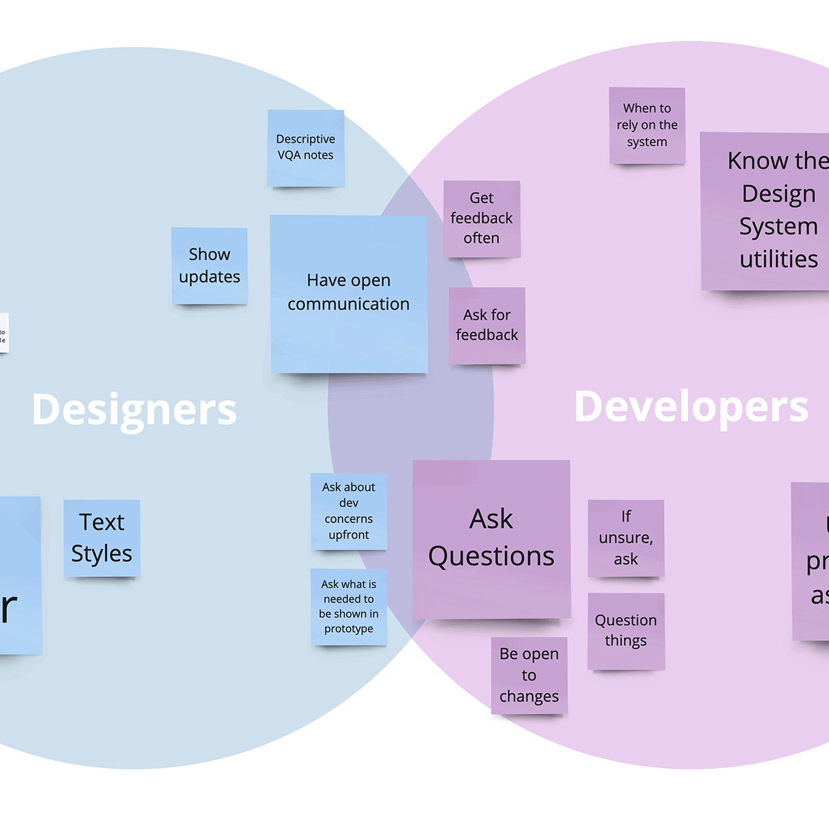
A process was created that included a multi-displinary review team accross design, development, and accessibility. This ensured that every component available was both design and ADA approved.
My role: I facilitated meetings with designers, and accessibility leaders, to learn their common problems reviewing other team's work, and create a process that they all were involved in.
Initial Launch
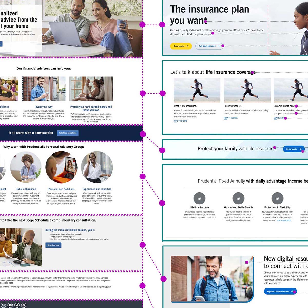
The Prudential.com homepageopens in a new window was the first page to launch that fully utilized the new design system. This page greatly increased viewership and the ease of doing business (EODB) scores, and fueled adoption of the design system company wide.

Adoption & Promotion
The design system started only as a pilot for the first launch on Prudential.com. Once the system had been shown to be successful, it fell on the team to focus on gaining adoption through promotion of the system to other teams.
To promote adoption across the organization, the team led workshops, created extensive documentation, and provided 1:1 support to designs and developers looking to adopt it.
My role: I ran over 10 workshops with designers. developers, and product owners, helping them improve their design/dev handoff, and providing guidance on how to leverage the system effectively.

Outcomes
- Established the first design system at Prudential
- 100+ UI components available
- 100% WCAG AA accessibility compliance
- Increased efficiency of the product lifecycle
- 100% reducution in time for design and development
- 100% decrease in ADA defects raised
- Gained adoption across the organization
- 200+ designers and developers supported
- 20+ products launched
- 8000+ pages live using the design system
Learnings
A design system is only as successful as the support of those asked to use it. Buy in from senior leadership, and the designers and developers asked to use it is crucial. The first job should be to meet the needs of those who need it, not hinder their work.
- Creating a design system requires a balance between conformity and flexibility. How will you keep designs aligned, without constraining your designers and developers from doing their jobs? Your system needs to find the be rigid enough to show a common design language, but flexible enough to give its users the space to explore new and improved ideas. At the end of the day, the system is there to help people, not hinder them.